Google, news

A sobering statistic that sheds light on the destruction of newspapers and magazines in the past half-decade.

In 2006, Google made $60 billion less than U.S. newspapers and magazines. Now it makes more ad money than all of U.S. print media combined. via

Yes, you read that right: Google’s $20 billion in ad revenue was better than every magazine and newspaper put together in 2012. Staggering.

Read More

The future of journalism in practice


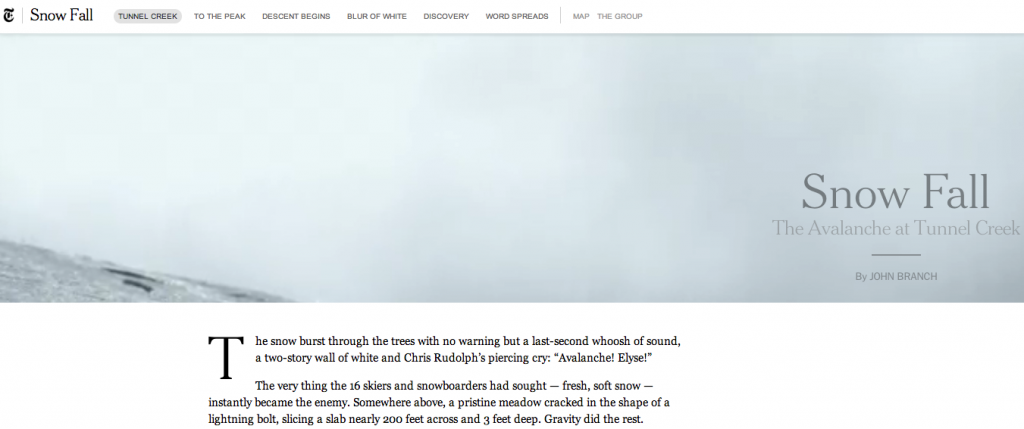
The New York Times turned the February avalanche at Tunnel Creek in Washington State into a completely absorbing multimedia experience. I was both spellbound and delighted by the video, audio, maps, photos, GIFs and most of all words, which all added up to an engaging, vital storytelling experience.

The gripping tale of the exciting lead-up to, feelings of dread about, and inevitable tragic end to the ski outing could have been told singularly by the Times. Only the Times (or a news organization of similar stature) could spend six months reporting a story that, according to the end credits “involved interviews with every survivor, the families of the deceased, first responders at Tunnel Creek, officials at Stevens Pass and snow-science experts” as well as reports from police, the medical examiner and 911 calls. Sixteen names in addition to John Branch’s (the writer) are listed in the credits (byline seems an even more outdated term than usual on this piece).

The article honors the victims and their families, approaches the survivors gracefully and tactfully, and serves as a cautionary tale to adventurers. And it fires up journalists and others who admire the well-reported, well-structured feature, a story form that has fallen out of favor in the era of pageviews, soundbites and 140-character updates. It’s as well written as anything I’ve read in the genre, including Jon Krakauer’s stuff, and it sets a new bar for multiformat journalism.

And it might even make money: Notice at the end, there’s a call-out to buy an e-book version of the article on Byliner.

For those of us who wring our hands about the death of print and the future of journalism, it’s nothing short of inspirational.

Read More

Are print-to-digital apps ruinous for media?

As I mentioned in a previous post, many of my recent freelance gigs have involved reading printed materials on various electronic devices. For several distinct projects, I read the same material on no fewer than four devices at a time, and each had a different layout, different size, different coding language and different interactive elements. This was the case because Apple, Amazon and the rest render their materials in different, proprietary programming languages, and the hardware they’ve created boasts proprietary specs. It has been a major shock to learn how much work and money must to go into optimizing the same printed material for all these devices. And it’s abundantly clear that as publishing professionals, we must do much more work, and soon, in establishing standards for print-to-digital conversion.

“Technology is always destroying jobs and always creating jobs, but in recent years the destruction has been happening faster than the creation.”
—Erik Brynjolfsson, an economist and director of the M.I.T. Center for Digital Business (via)

Arguably, this obtuse process is employing me. The technology has, in this case, created a new job: There’s a need for someone to read each article of each issue (or each page of each chapter of each book) on each device. I don’t want to sound ungrateful, because I’m developing quite a little niche for myself as an expert on print-to-digital conversions. But I wonder how long it can last, considering that print media is undergoing huge change at the moment. Momentous, disruptive, industry-wide change that’s happening at a rapid pace, particularly with regard to technology.

We might be powerhouse publishers, but in the tech world we’re just like every other Joe App Maker, 96 percent of whom do not make significant money on their apps. According to a recent article in the New York Times, 25 percent of Apple game app makers made less than $200, with only 4 percent making upwards of $1 million. Granted, random game app makers don’t have the brand recognition or cachet of major publishing houses; neither do they have an overarching, Apple-endorsed app that features their stuff (Newsstand for Apple, if you’re still following me).

But make no mistake, the field has been leveled, and instead of competing only with each other, even the biggest content publishers now also compete with Angry Birds, Twitter, Facebook, travel apps, e-commerce apps, dining apps, coupon apps…the list is endless.

The difference? Unlike many apps, the media’s brand relevance and reputation absolutely hinges on an amazing user experience across devices at all times. In short, it has to be perfect. And in order for that to happen, the same material must be reconceived by its creators multiple times. It seems impossible to believe, but publishers optimize the same product over and over again, incurring all sorts of real costs from designers, editors, producers and programmers with each iteration. (And this isn’t even counting the web producers who conceive it all over again for the online version!) Once you account for these costs, in addition to the so-called legacy costs of creating the print product in the first place, it hardly makes sense even to enter into the realm of app creation for many print products. That’s even if you can get your app sponsored or otherwise monetized, and even if you use Adobe to help you create it.

I realize that the common line of thought is that, like websites, if you don’t have an app presence, you don’t exist. Half a decade ago, this principle propelled the creation of a million new half-assed websites (websites: another print-distribution model without a standard!). But I’d counter that without apps — without content — these devices would be useless. So unless we want to bankrupt the already struggling print media industry further, we must stop playing by the device makers’ rules and rewrite them to benefit our business. We must invent technology that adapts our product (ie, content) to any device at any orientation. We must create or help market forces create a standard we can implement and follow; we must negotiate a better rate than giving away 30 percent of our revenue; we must not “throw in” digital access with print subscriptions.

I know, I know: Nature abhors a vacuum. If we don’t follow suit, we’re nothing. But following hardware makers blindly down dark passageways as our pockets get picked around every corner isn’t a smart strategy, either. In one big way, we are not like Joe App Maker: We possess a hugely powerful medium. We must harness our strengths and lead ourselves forward. A nice start might be to begin taking a stand against having to endlessly tinker with every article in every issue of every magazine, every book, every design.

As Shawn Grimes, the app developer profiled by the Times said: “People used to expect companies to take care of them. Now you’re in charge of your own destiny, for better or worse.” Let’s be in charge of our own destiny.

Related: Read my post about the best e-reading devices.

Read More
The best e-reading devices, as determined by a control group of one

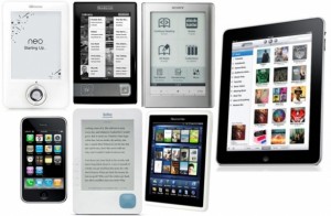
Many of my recent freelance gigs have involved reading printed materials on various electronic devices, so I’ve basically become a one-woman control group for determining the best device-reading experience. I’ve had the opportunity to directly compare the following devices: Kindle E-Ink, Third-Generation Kindle (“Keyboard Kindle”), Fourth Generation Kindle, Kindle Fire, Kindle Fire HD, Samsung Galaxy, iPad 2 and iPad 3.
Ready for the results? The winner is…the iPad 3 with retina display!

The result is perhaps not surprising, but the gap in performance and readability among all of these devices versus the iPad 3 really is shocking. The iPad 3, in addition to being a more more sleek and elegant experience overall for the user, is also far, far easier to read. The display is better than even the original printed product to which I was comparing it, believe it or not. The words are clearer and crisper; the photos are deeper and livelier.

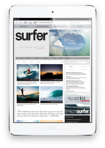
When evaluating tablets, we must start with the premise that every six months a new one is released, and that the newer versions are superior to the previous generations. That leaves truly valid comparisons, at the moment, between only the iPad Mini, the iPad 3 and the Kindle Fire HD. Setting aside the iPad Mini for the moment because it doesn’t (for some stupid reason) yet have retina display, that leaves the latter two. Perhaps to casual users, the gap between the iPad 3 and the Kindle Fire HD isn’t noticeable, but having spent many weeks putting down one device and picking up the other, I can tell you with certainty that the Apple product blows the Amazon one out of the water.

I acknowledge that I am an Apple person. I have an iMac, an iPad 2 and an iPhone, and when I had a Droid phone for about six weeks last year, I wanted to throw it out the window. (Except Swype. I love Swype! Why doesn’t Apple have Swype?!) So for me, the Apple experience — gestures that just seem to make sense, buttons where they should be, seamless navigation among apps, access to hundreds of thousands of other amazing and useful apps — in addition to the reading experience put the device in a field of its own.

Is the difference in quality worth $200 ($499 for iPad 3 versus $299 for Kindle), especially if you aren’t already living the Apple lifestyle? It depends what you want to use it for and how much weight you want to tote around town, but for my money, even if — or maybe especially if — you only use it to read books and magazines, the retina display is such a game changer that I absolutely think so.

Separately from work, I recently test-drove a Microsoft Surface briefly, and my initial thoughts were that it might be nice if you already live in the Windows universe — native Outlook and Excel apps, for example — but it really doesn’t do anything better than the iPad does. And that includes the weird add-on cover keyboards, which are either nontactile (in other words, useless versus the virtual) or just small enough compared to a normal keyboard as to be aggravating. (And this is coming from someone who loathes Apple’s virtual keyboard.)

I’ve also had the opportunity to play with the seven-inch Nexus, which has a nice hand-feel and is extremely portable. I don’t think this makes up for its lack of sensible navigation or access to trusted apps, but it’s an OK alternative to the real game-changing device, which will be the next-generation iPad Mini, with retina display. (True story: I’ve never even laid eyes on a real-life Nook.)

It’s a safe bet that when the iPad Mini with retina display — small enough to feel good in the hands and fit in the bag, but with the text clarity of the iPad 3 — comes to market, I’ll be first in line.

Related: Read my post about why print-to-digital conversion is more difficult and more expensive than it should be.

Read More

“What happened to The Daily?” quote roundup

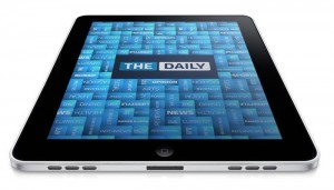
The Daily, News Corp.’s general-interest iPad news product, shut down this week. Media experts (or perhaps I should say “observers”—I’m not sure the media has any experts anymore) disagree on the specific reasons it failed, but they do seem to agree that it was doomed. The columns I’ve read and rounded up from around the web cite the following three conclusions:

1. Making it available only via iPad and without access to the open social web (readers couldn’t share links) made it a walled garden.

“The Daily’s device-bound nature limited its potential…. Locking into a single platform and not having a web front door limiting sharing and social promotion.” —Joshua Benton

“Publishing for a single platform, whether print, web, or the iPad, is a foolish move, and I think we knew that before The Daily was excised from News Corp.’s balance sheet.” —Ben Jackson

“The product, its content and the conversation around it should have been porous, able to flow in and out of social media platforms and be informed by them. Content should have been unlocked, and made available to subscribers on all platforms.” —Jordan Kurzweil

“More than 54 million people in the U.S. use an iPad at least once a month, but they remain just 16.8% of the population and 22.2% of people on the internet, according to eMarketer. That put a hard cap on the number of subscribers The Daily could acquire no matter how solid its product.” —Nat Ives

2. It was overburdened with staff—despite already laying off a third of the staff over the summer—and and a “legacy” (ie, print) org structure

“Simply put, The Daily never attracted the revenue required to support a team of 120 people. Launching what amounted to a digital daily newspaper with many of the legacy costs and structures of print wasn’t the best idea.” —Hamish McKenzie

“The Daily should have been run like a startup, a digital business, not a division within a division in a corporation.” —Jordan Kurzweil

3. It wasn’t interesting content (apparently! I never read it…see No. 1)

“Though it looked quite nice and its content was competent, that content was all-in-all just news and news is a commodity available for free in many other places.” —Jeff Jarvis

“[The term general reader means] a media executive is imagining himself and his friends (you know, normal guys) and intending to produce a bundle of content for that hyperspecific DC-to-Boston-went-to-a-good-college-polo-shirts-and-grilling demographic…. This is not to say that media properties cannot be built with the goal of reaching the mainstream [but successful] sites have been built up like sedimentary rock from a bunch of smaller microaudiences. Layers of audience stack on top one another to reach high up the trafficometer.” —Alexis Magrigal

Whatever the reasons it was closed down, I’m glad someone at least experimented with new ways to produce news. Trying stuff really is the only way to learn. My condolences to those journalists who were laid off. They should consider the no doubt multitude of lessons they’ve learned and call themselves, rather than out-of-work journos, technicians in the lab of digital journalism — scientists who can take the knowledge they’ve gleaned and apply it to the next experiment.

Read More

Broadway reviews, part two

As I mentioned last month, I’ve recently had the opportunity to be part of the Broadway.com Word of Mouth Panel for the 2012–13 theater season. I get amazing seats at new shows for free, and my only obligation is to have an opinion on it afterward — not a big challenge! Here are my reviews of Annie (loved it!) and Dead Accounts (didn’t love it!). Click on my face to play!


Annie video review:

Dead Accounts video review:

Read More